Spot On Children’s Festival
Visual Identity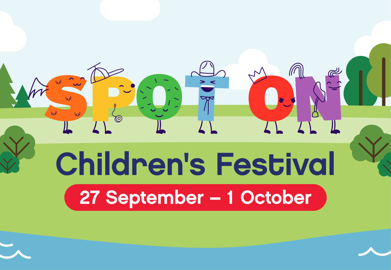
CLIENT
Riverside Theatres Parramatta
CHALLENGE
Riverside Theatres Parramatta was keen to refresh the branding of their annual Spot On Children’s Festival.
SOLUTION
Our primary goal was to evolve the existing Spot On Children’s Festival branding to make it more colourful and more broadly appealing. In essence, to give it a stronger and more commercial presence in the highly competitive festival market.
The final design uses a hand-drawn line detail that works around to the digital letterforms of the Spot On name, providing each one with its own unique personality, style and character.
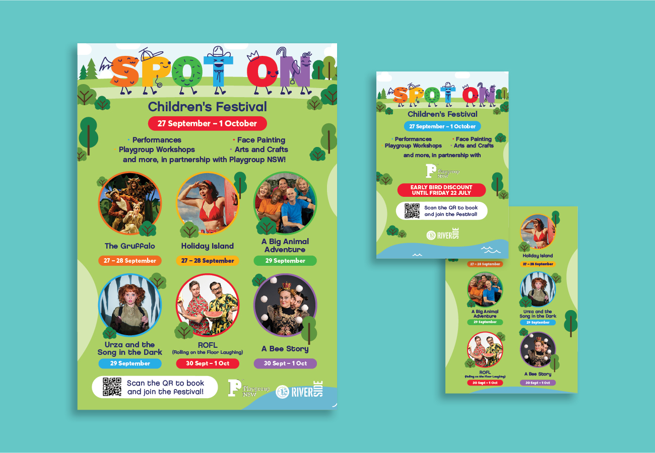
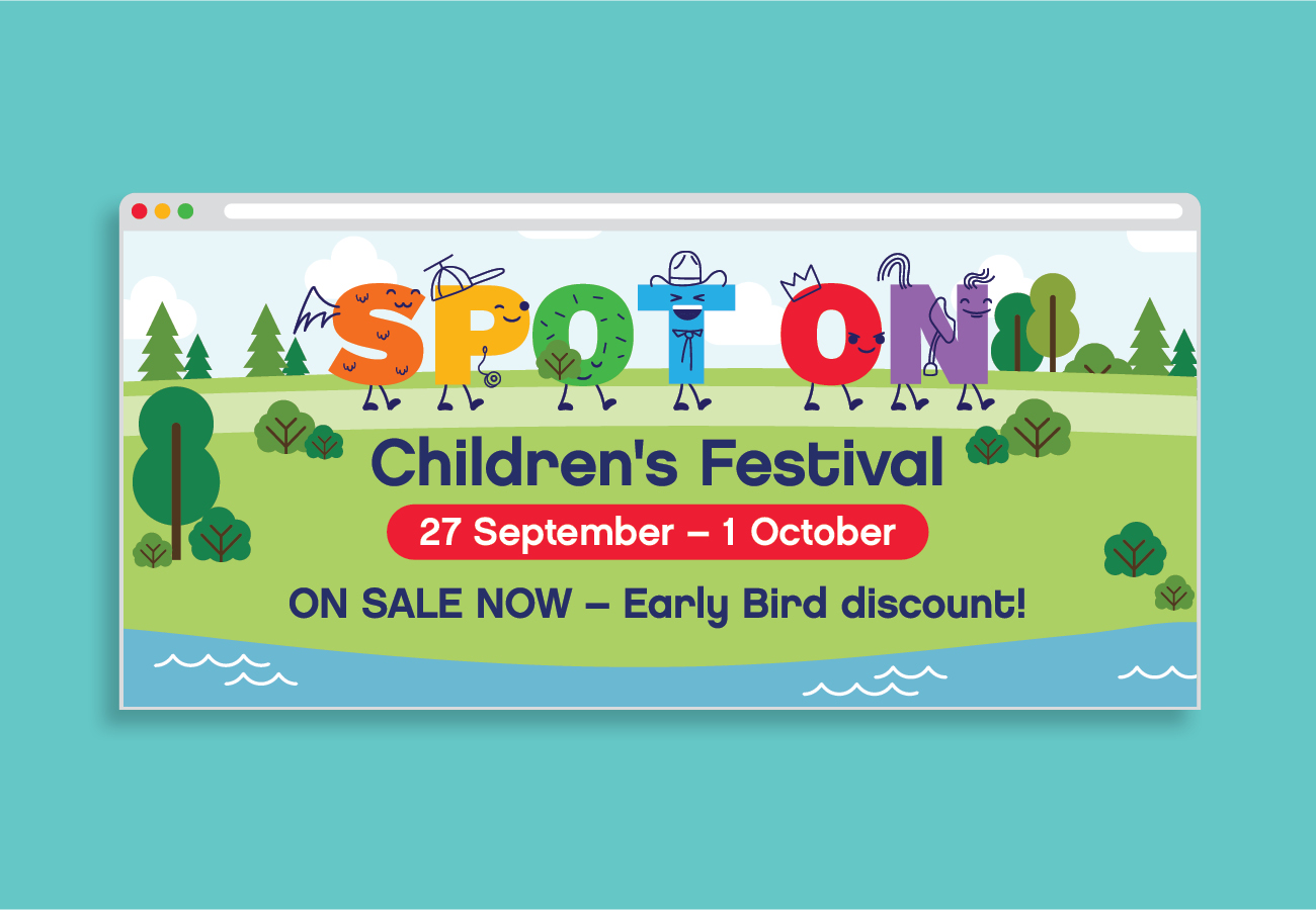
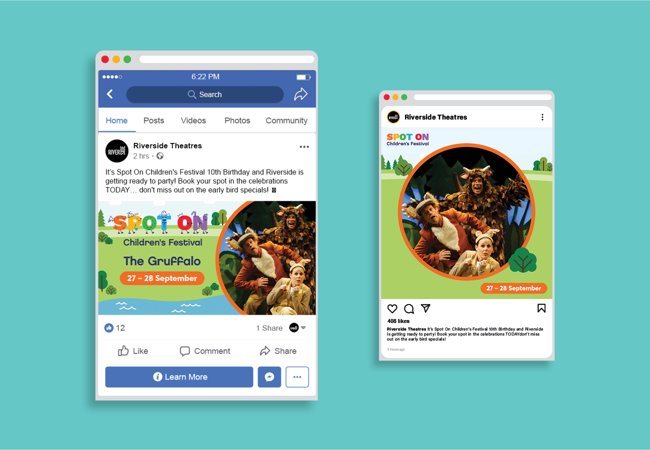
We also wanted to ensure the new branding was more than just a logo by developing a complete brand framework. As such we created a modular set of elements that are able to handle a diverse set of content types and formats. Essentially it is flexible, dynamic and broad enough to be used in new and unexpected ways, across multiple platforms and media.
Part of this system is a branded world for the characters to inhabit, in the form of a simple and highly relatable park setting. In the park the featured shows and attractions surround the characters as they journey along the path and through the festival.
The flexible grid designs make it easy to adapt the branding for whatever purpose, whether it be online, or print, something tall or wide or even animated.