Solar Skin Branding
Visual Identity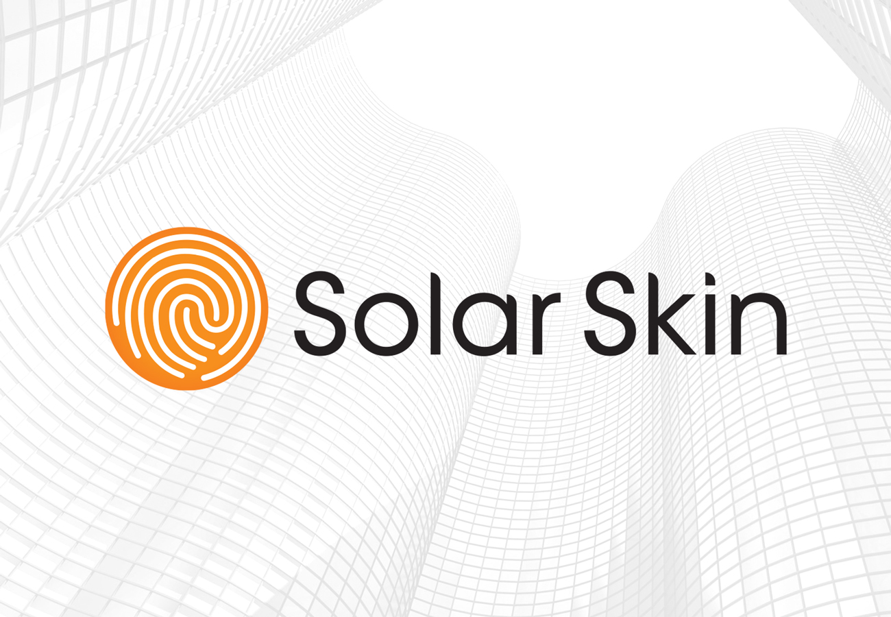
CLIENT
Solar Skin
CHALLENGE
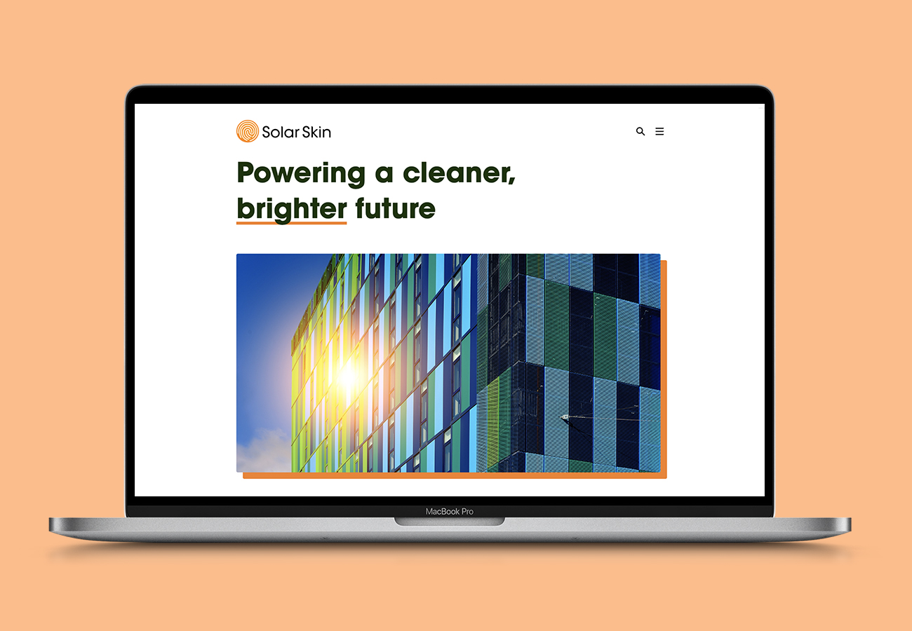
We were invited to develop the branding for an exciting and innovative new company at the forefront of cleaner and greener solar energy. Subsequently we designed and developed the company’s website.
SOLUTION
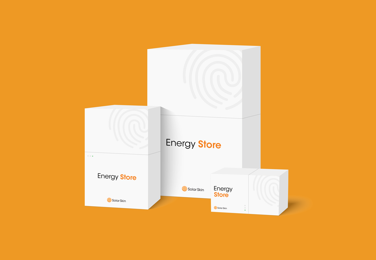
Solar Skin is a unique clean energy delivery system developed by Flame Security International, global leaders in solar photovoltaic energy, highly advanced printing technology, and fire protection.
Solar Skin uses environmentally-friendly materials and unique processes, with clear advantages over non-renewable energy and older solar technology, Solar Skin has the potential to lead the clean energy future.
We wanted to capture the powerful brand promise in a simple, efficient and bold design that literally captures the brand DNA. Solar Skin is dynamic, progressive and flexible with enormous potential to shape our future. The branding conveys these qualities. It’s optimistic, efficient and communicates a clear message that supports the company’s endeavours.
The design plays on the name Solar Skin by embedding the ridges, or skin, of a thumbprint into a shape representing the sun – marking the unique and individual brand that is Solar Skin. The gentle curves of the thumbprint represent human skin, circuitry and the circular economy of the product. A circle with a faint yellow-orange gradient alludes to the solar energy used by the product. The sleek and slender geometric typeface coordinates with the round and organic edges of the icon.
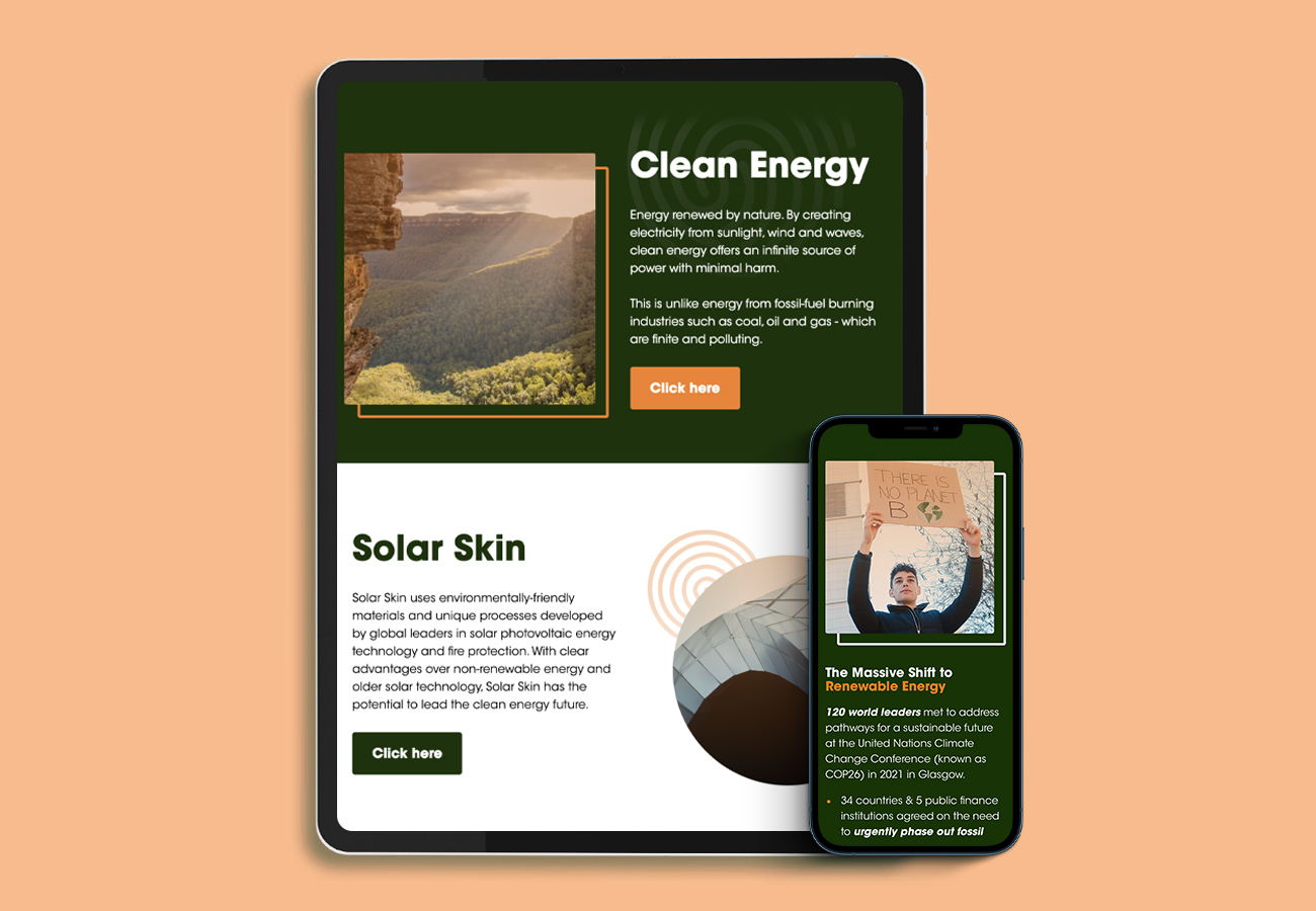
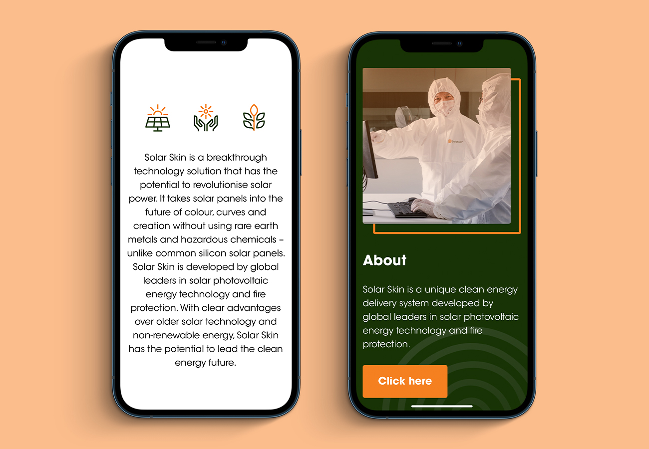
The website design is clean and bold and delivers an intuitive user experience, similar to using an app on a phone.
