MOSAIC
Visual Identity and Branding

CLIENT
The Australian National University
CHALLENGE
We were asked to develop branding for a new research project to develop a new treatment to restore normal stem cell production, with the goal of preventing the complications of ageing.
SOLUTION
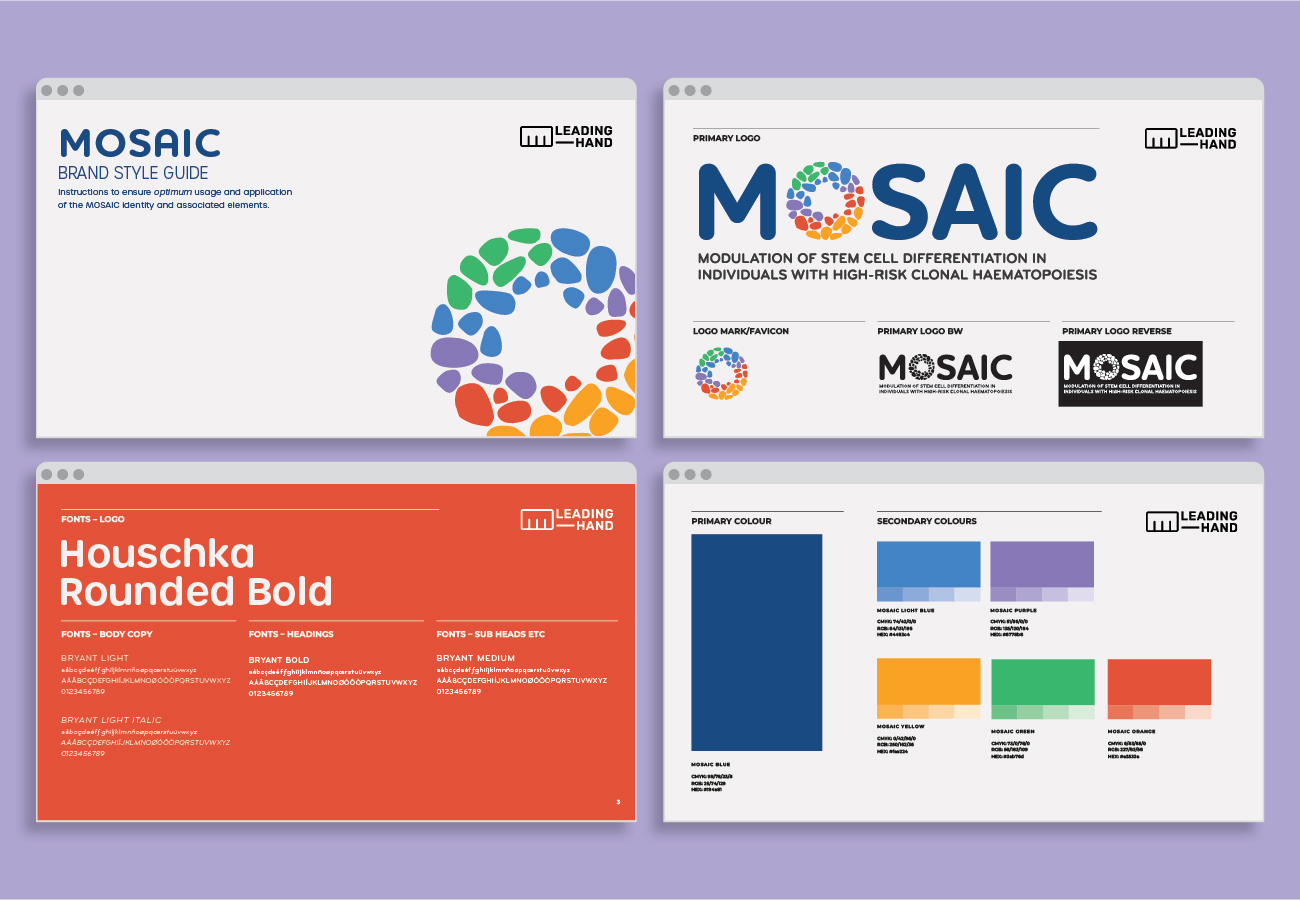
Our design team developed three potential concepts to brand this important and unique research study. Our client, the Australian National University, chose the concept using the letter “O” to illustrate the ideas of cells and their potential variations. The “O” is created from shapes reminiscent of a mosaic tile design, speaking both to the name and the subject of the study. The logo’s vibrant colours further emphasise the range and depth of the study and what it aims to explore.
