Leading Hand is 20 years old on 1 July. To celebrate this auspicious occasion, we’re going to feature 20 jobs that we’ve done along the way. Here are the first 10 to get you started!
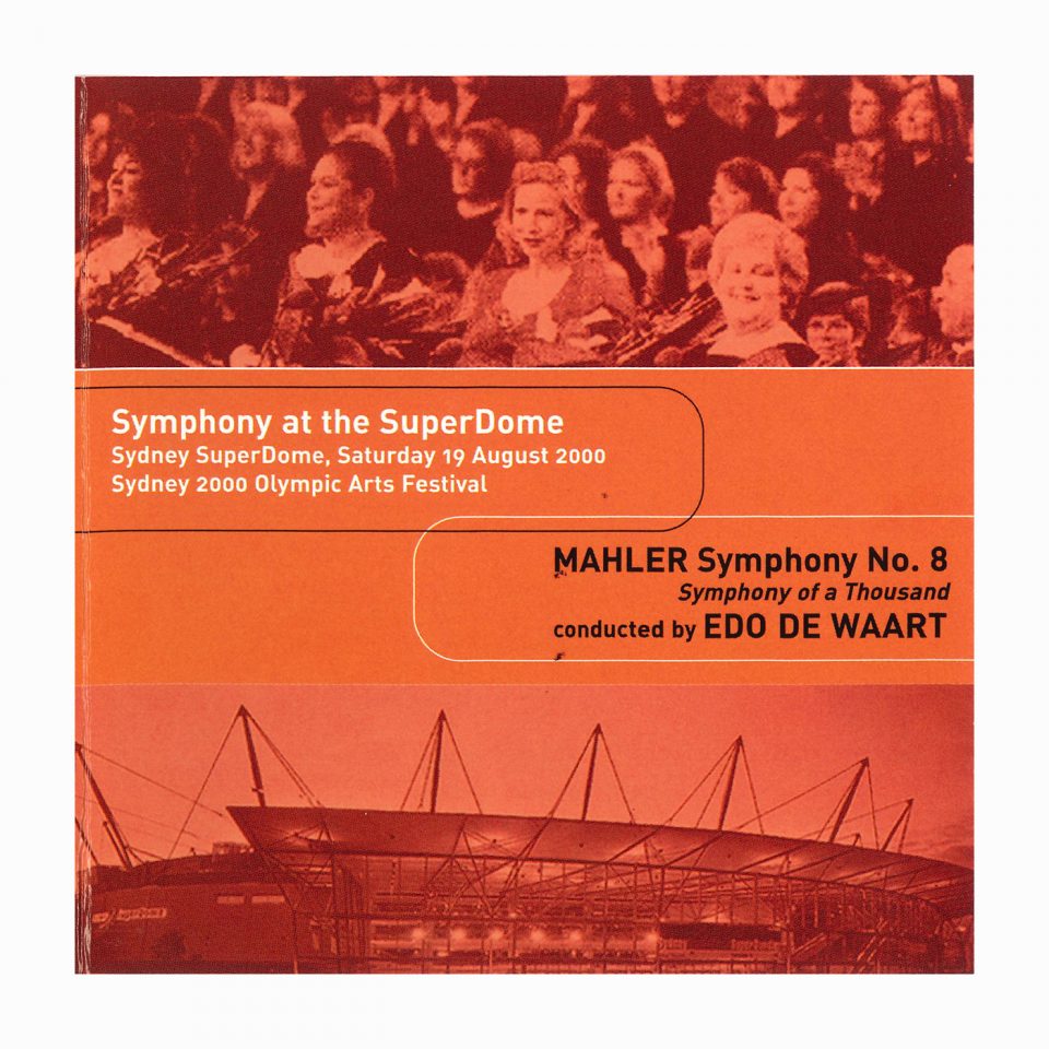
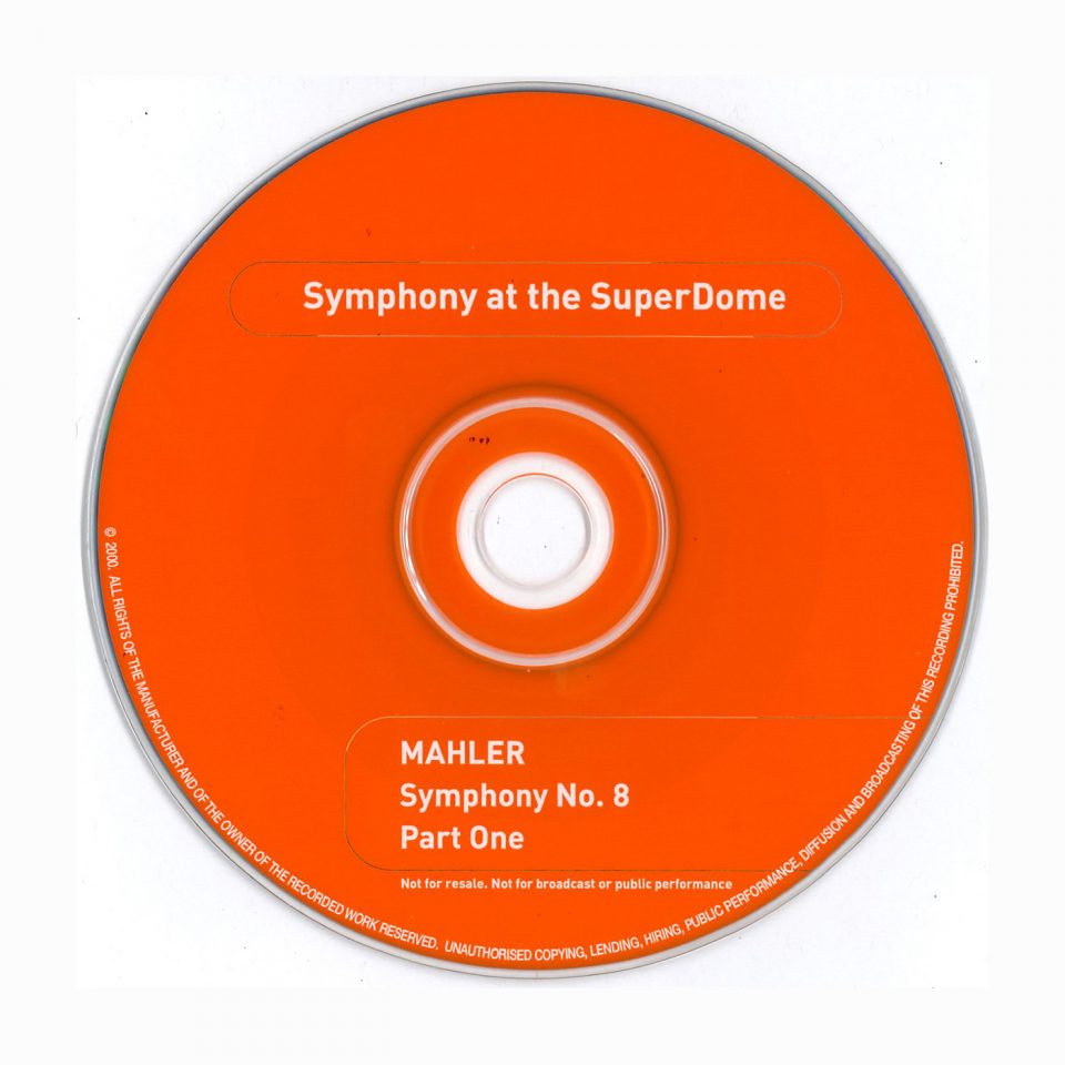
Number 20 is our Creative Director’s first freelance job which was essentially the beginning of Leading Hand Design. A CD cover for the SSO – complete with the obligatory fin-de-siecle “squircles” and PMS021 orange – this job was very special for Jamie as he worked at the Sydney Symphony as a marketer just before retraining as a graphic designer. Leading Hand still works with the Sydney Symphony and hope to in another 20 years’ time!
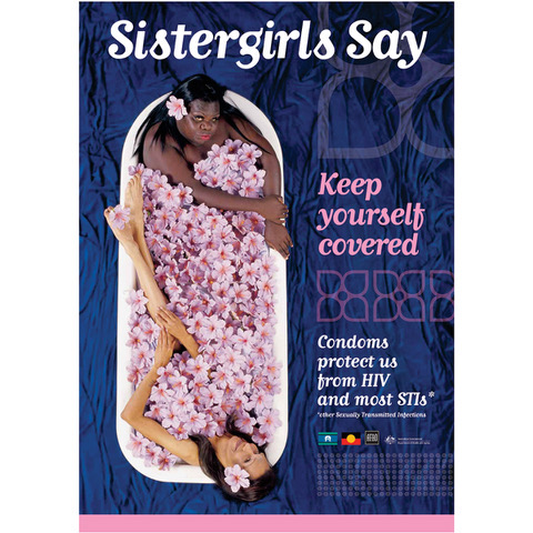
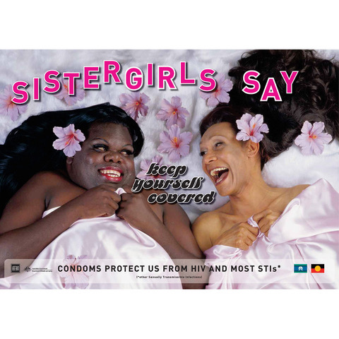
Number 19 is definitely one of our favourite jobs to date. Around 2002 we were asked by the Australian Federation of AIDS Organisations (AFAO) to create an awareness campaign for the National Indigenous Gay, Sistergirl & Transgender HIV/AIDS Sexual Health Project. Easy, right? Not quite. Turns out that the symbol for the Sistergirl community is a purple hibiscus. None of which could be found. Anywhere. So we set about spray painting hundreds and hundreds of artificial white hibiscuses the correct hue. Quite a feat in itself. Then we had to haul a claw foot bathtub up into the studio of our photographer Garrie Maguire where our beauty crew, including the wonderful Anthrony Carthew, started the transformation of Crystal Johnston and Rusty Nannup into their glamorous camera-ready selves. It was such an amazing, happy day and we ended up with a really beautiful campaign that us and AFAO were very proud of and the Sistergirl community deemed absolutely deadly. Go girls!
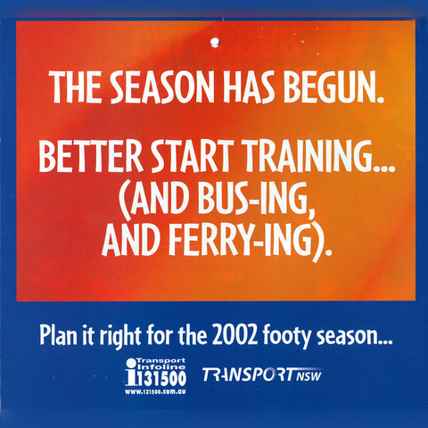
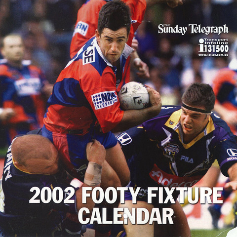
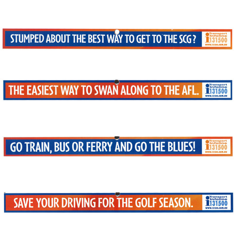
Number 18 is a copywriting job we were asked to do back in 2002 by Transport NSW to promote public transport as the best way to get to sporting matches. So, basically, the gig was writing dad jokes to go on a calendar. Well that’s not how it was briefed but definitely how it landed. One of the more left field jobs we’ve had but still makes us laugh today. It really is the simple things…
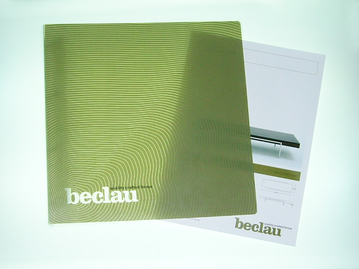
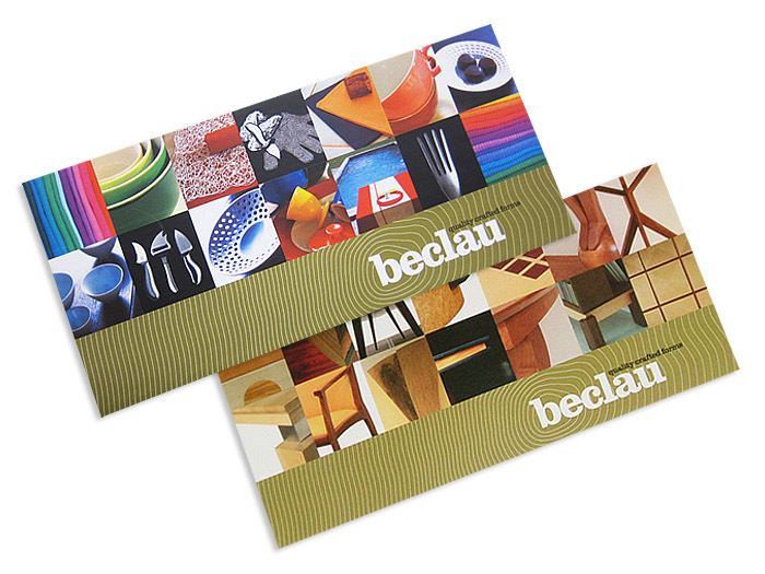
Number 17, which was about 17 years ago, is one of the first visual identities we were asked to do. It was for a high-end furniture maker and importer of European homewares called Beclau, introduced to us by our friend, client and amazing interior designer Stephen Collins. Our branding was intended to communicate the hand-made nature of Beclau’s beautiful work, mostly made from timber (and often designed by Stephen!). We designed a vast range of collateral over our 10 years with Beclau and think it still holds up pretty well today!
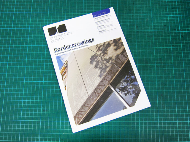
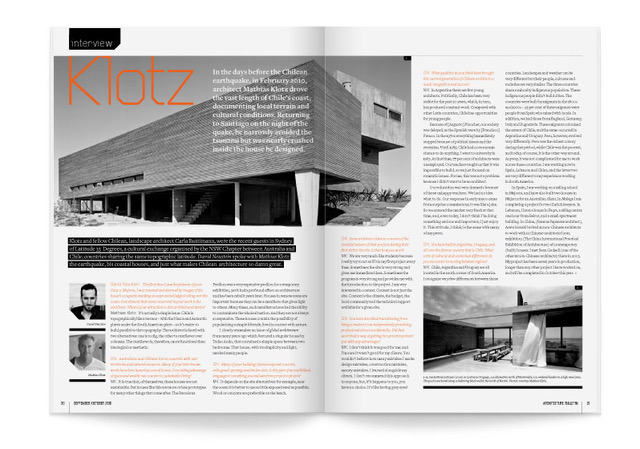
Number 16 is our redesign and subsequent art direction and design of the Architecture Bulletin for the NSW chapter of the Australian Institute of Architects. Our first task was to develop a new masthead for the magazine using the initials AB. This device informed the clipped corners of cover images, editorial images and graphic elements throughout the publication. We worked on the magazine for just under four years and enjoyed every minute!
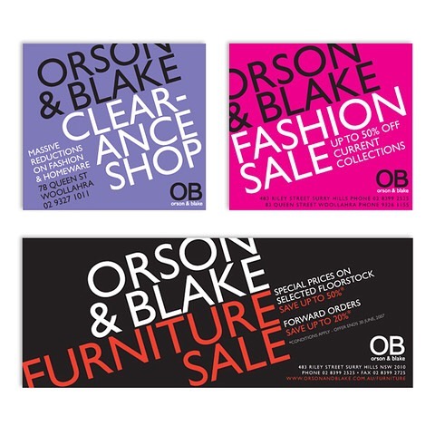
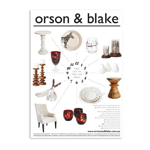
Number 15 is more about a great client than a particular job. Orson & Blake were one of our first regular clients recommended by our lovely pal Lisa, who was working there at the time. When we first met David and Mandy, the mother and son team who were behind O&B, we knew they were going to be a dream to work with… and they were. Having cut his teeth on retail advertising at Young & Rubicam in Adelaide, our Creative Director (Jamie) was right at home writing and designing the newspaper and magazine ads that were just a small part of all of the work we did for O&B.
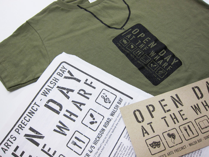
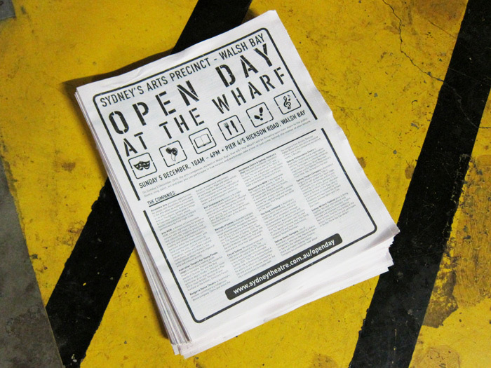
Number 14 is one of the many fantastic projects we were lucky enough to work on with the Sydney Theatre Company between 2007-2012. Our very good friend Rani Haywood, who had been our client at her former posting with the ACO, brought us on board to work on special projects and one of the special-est of those jobs was for the STC’s Open Day at the Wharf in 2010. The day ended up being a huge success and the Leading Hand team thoroughly enjoyed the process.
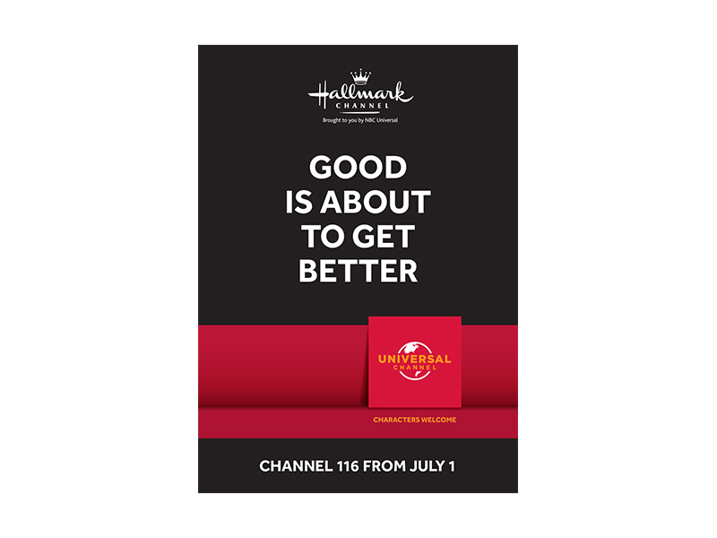
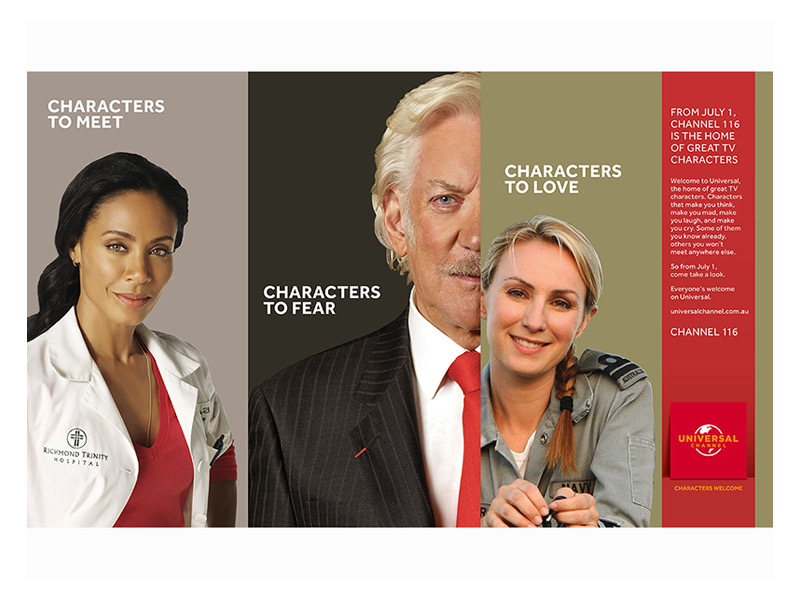
Number 13 is from one of our foundation clients who we were fortunate enough to work with for nearly 12 years. Our good friend Cameron Craig and his colleague, Ros Jones, started the Hallmark Channel in Australia from the ground up and it was a roaring success. So much so that they were soon running the Australian arm of NBC Universal which prompted the launch of the Universal Channel, the first of numerous channels to fall under their watchful eye, again with amazing results. It was not only a privilege to work with such talented, respected and experienced individuals but also meant I got a couple of lovely lunches at Christine Manfield’s universal restaurant where the launch was held (we had to have a test run!). Proves there really is such a thing as a free lunch!
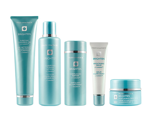
Number 12 was for a client we worked with for 10 years, Nutrimetics. It was 2006 when we were first approached to collaborate with the Australian beauty brand and we worked on literally hundreds of designs for special promotions, new product lines and, most regularly, their core skin care ranges. It was also in 2006 that The Devil Wears Prada was released, in which Meryl Streep’s character, Miranda Priestly, dresses down her assistant in relation to a particular shade of blue “… that sweater is not just blue, it’s not turquoise, it’s not lapis, it’s actually cerulean.”. In 2007, we were tasked by Nutrimetics to develop a colour for the new Brighten skin care range that was in the pipeline. Preferably blue. But it couldn’t be just any blue, it had to be just right. We spent weeks and weeks looking at car ducos, artworks, fabrics… you name it. We finally came to an agreement on the perfect blue that we had mixed up specially for us at Porters Paints. A blue that could really only be described as, you guessed it, cerulean!
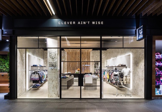
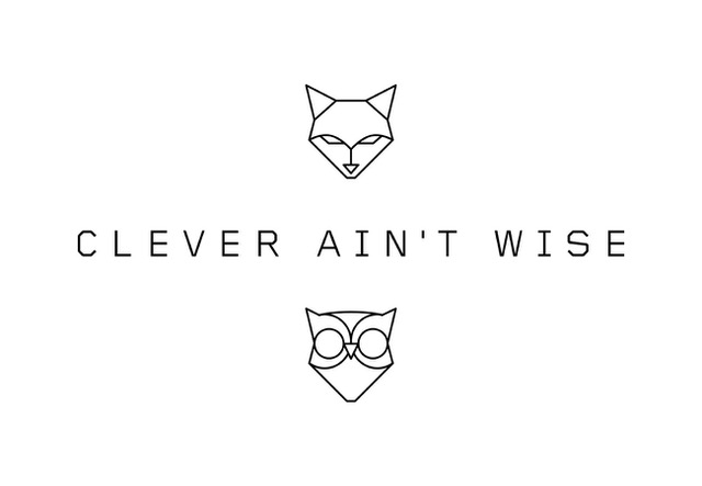
Number 11 is one of our favourite branding projects we’ve worked on, mainly because it was just so damn cute! The super lovely Sophie Boyd came to us with her plan to open a fashion boutique. Her enthusiasm and optimism was so refreshing and she was so passionate about the project that we became equally as excited to be a part of it. The Leading Hand team set about developing a number of options for her to choose from. She chose our favourite concept (yay!) and Clever Ain’t Wise has now been a successful, vibrant business for nearly 6 years. Well done Sophie!
Keep an eye out next week for the continuation of our 20 Years Down countdown!